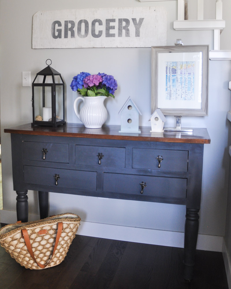
Yesterday, I promised that I would chat a bit about the newest sign to be added to my walls. It was a quick and easy DIY, and it’s caused me to want to grab all of the scrap wood I can find.
This “Grocery” sign was made with one of my favourite stencils evahhhhh…. from my friend, Donna of Funky Junk Interior’s line of Funky Junk Old Sign Stencils.
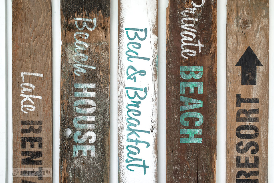
She’s just released some really fabulous beach and garden-themed stencils, so if you’re feeling particularly inspired after this post, head over and check out her offerings. My next project is going to be using her Beach House stencil.
To make your own stenciled sign, you will need:
A surface to stencil on
A stencil
Painter’s tape
A paint brush – preferably round and of decent quality
Paint for stenciling – I used Fusion Mineral Paint
A towel, paper towel, or a scrap of wood to “dab” off extra paint
Sandpaper in a fine grit (180 is what I grabbed from my stash)
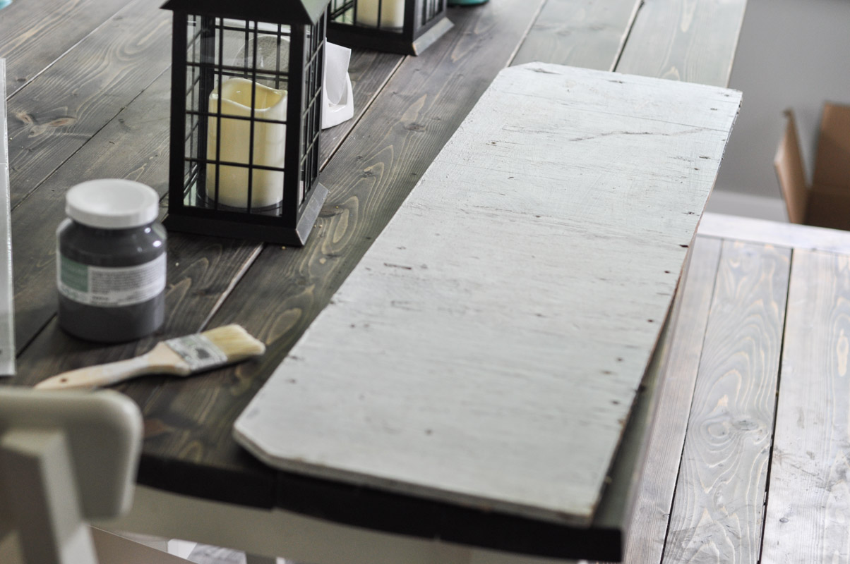
This piece of wood had been hanging out in the garage, mostly taking up space. It was rough around the edges and had a worn coat of white paint on it. I had the feeling that it would be a perfect base for the Grocery stencil.
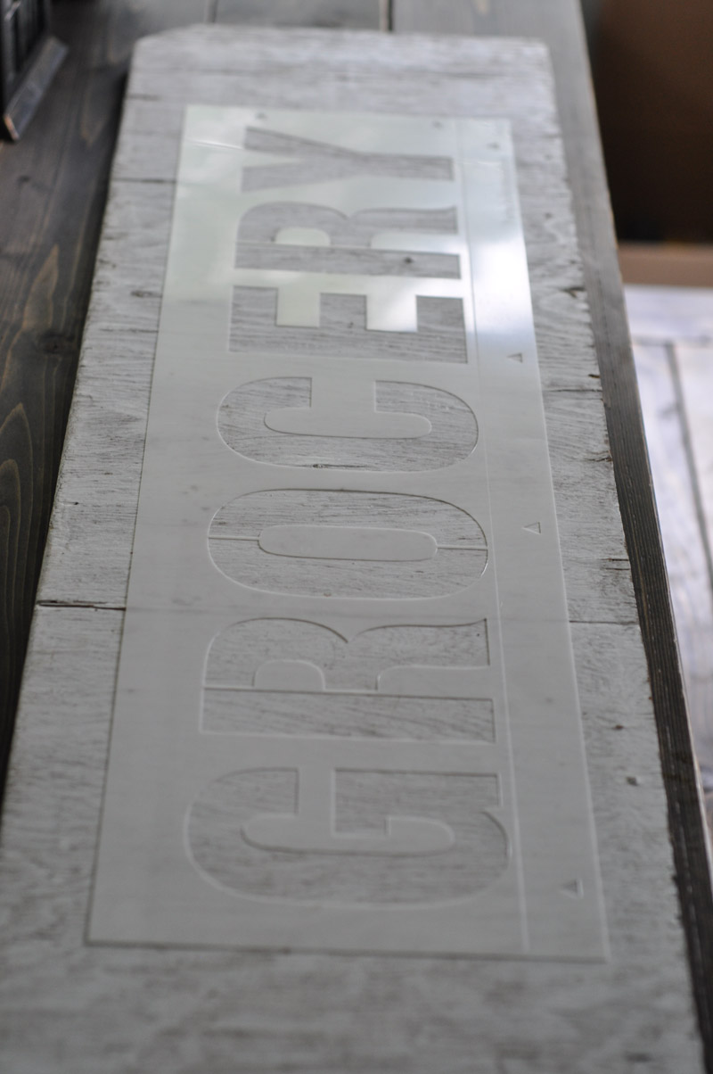
Depending on the surface, I sometimes use painter’s tape to secure the stencil to the board – in this case, the surface was “grippy” enough that the stencil didn’t move around that much.
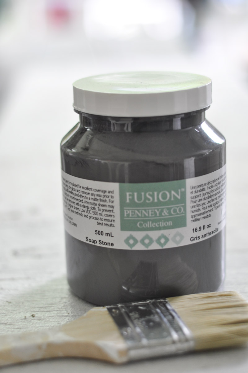
For this project, I used Soap Stone from Fusion’s Michael Penney line. It’s a nice dark grey with warm undertones.
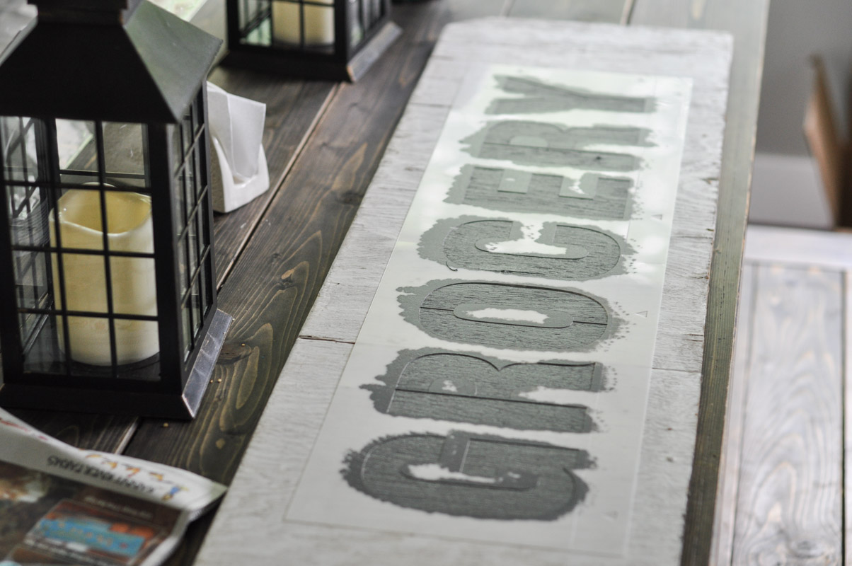
The secret to getting clean lines when stencilling is having a dry brush. Every time I dipped my brush into the paint, I then dabbed it off onto my paper towel until the brush seemed “dry”. This means that you have the most control over the paint and you won’t get the dreaded bleed under the stencil.
I used a tapping motion to apply the paint to the stencil. It takes a bit longer with the dry brush, but the lines are crisper and there aren’t any blobs or globs to deal with.
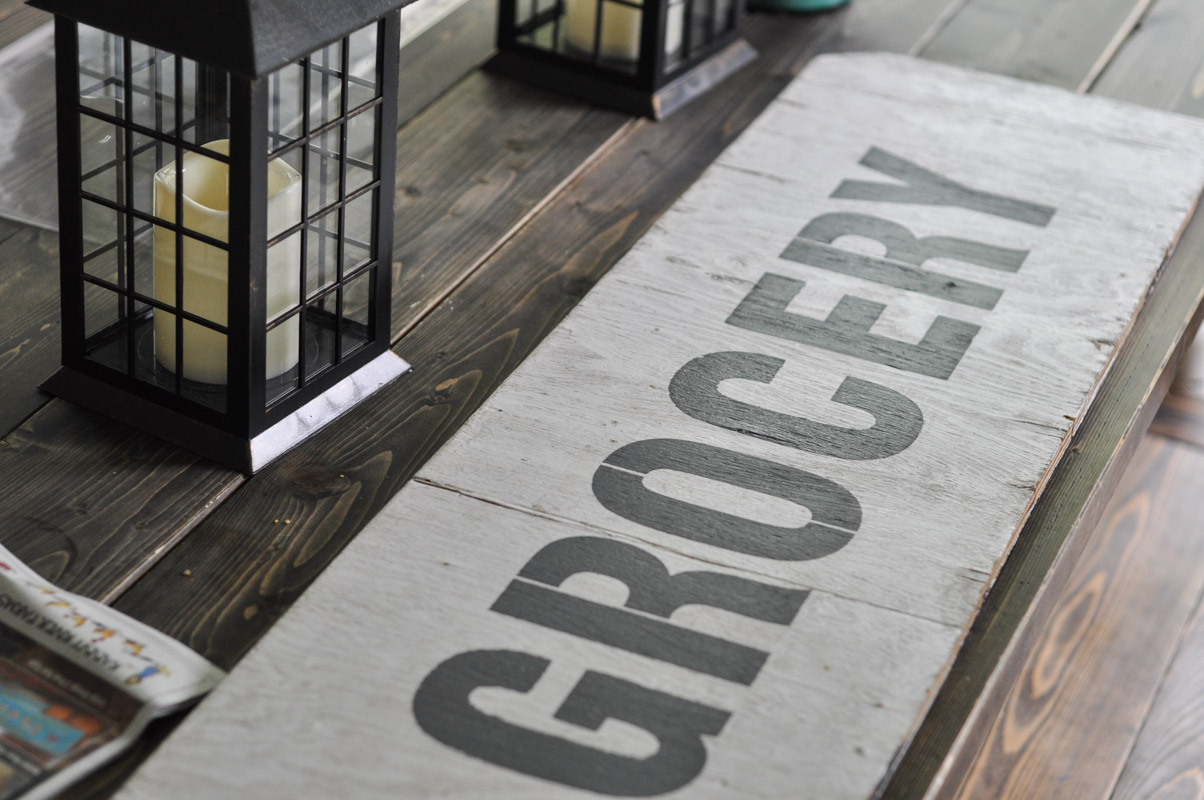
One I had finished painting, I removed the stencil immediately and washed it off. I loved the clean edges I had gotten, but a vintage sign wouldn’t be so sharp, would it?
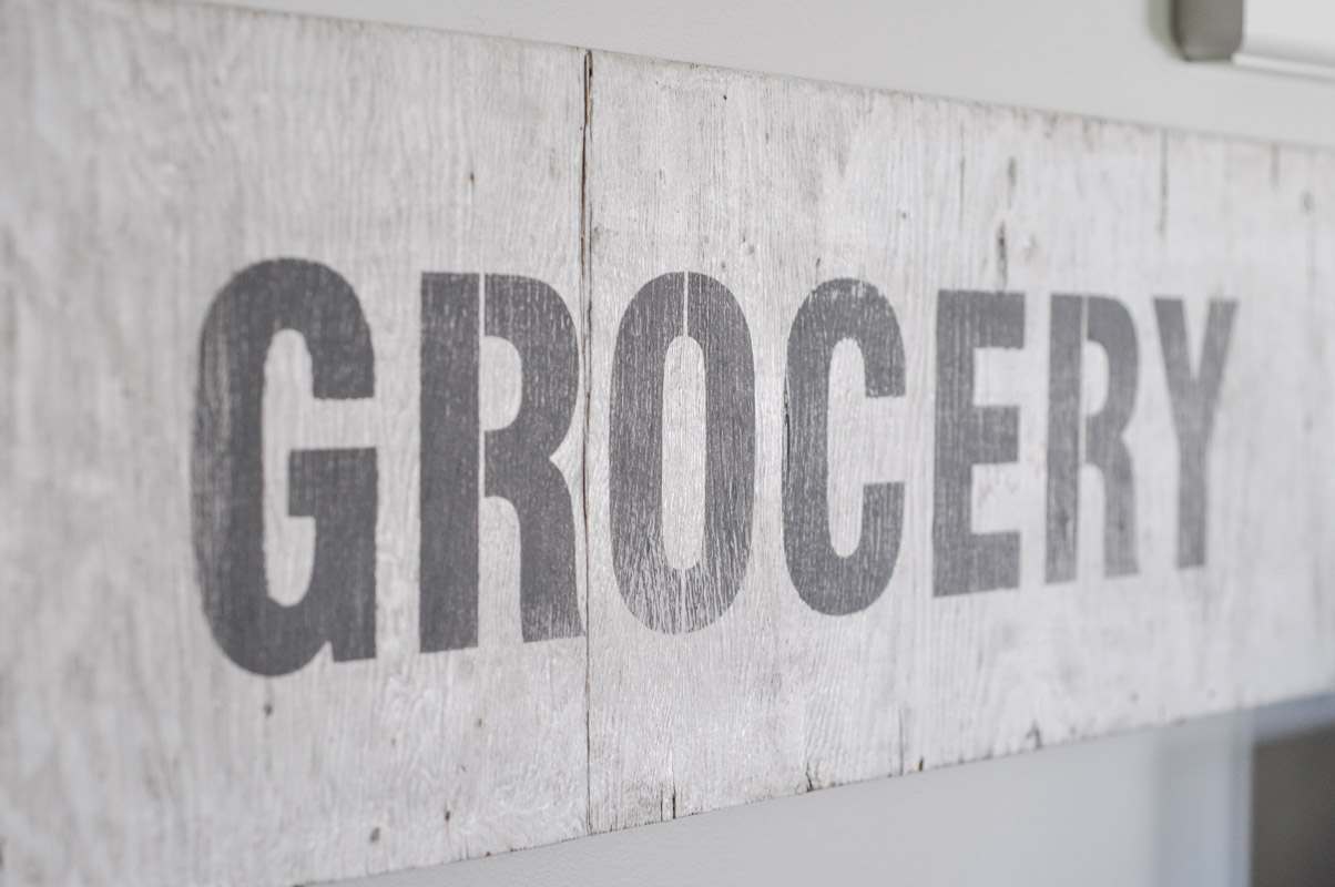
A once-over with sandpaper added some age to the piece.
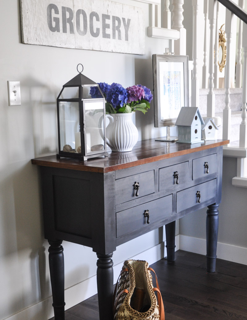
Now the sign has pride-of-place in the front entry, and I’m ready to start on my next project!
Which one of Donna’s stencils would you want to try out? I think that “Beach Resort” is my next project!
Check out more sign projects here:
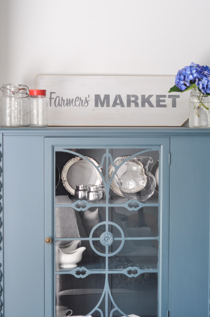






3 comments
Fashion Retail Management
Love the way you write 🙂
Hancocks London
Great Post! You are sharing a wonderful post. Thanks and keep sharing.
Hancocks London
Great Post! You are sharing a wonderful post. Thanks and keep sharing.
https://www.hancocks-london.com/