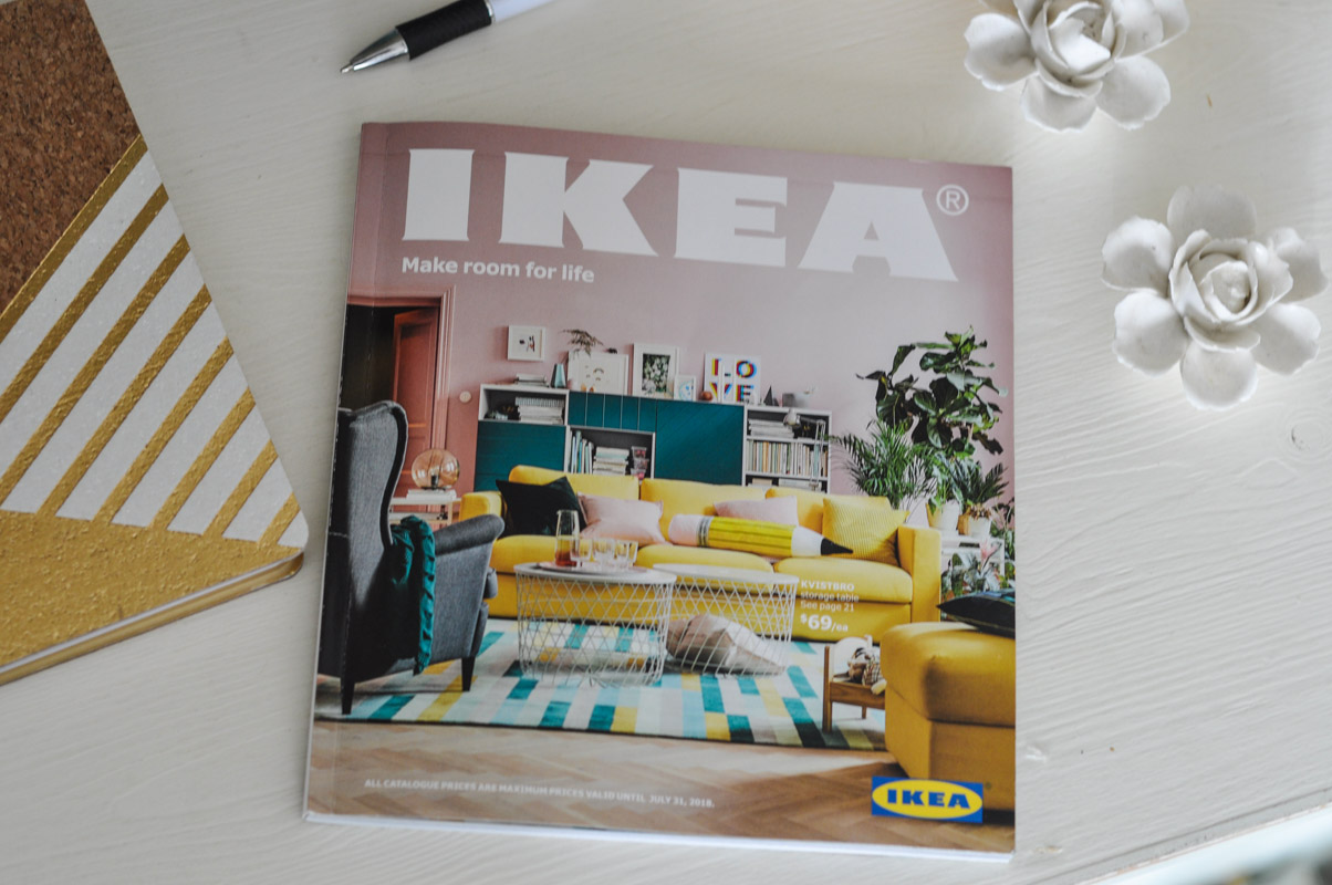
This is a sponsored post written by me on behalf of IKEA Canada. All opinions are 100% mine.
When I got an email asking me if I’d like a sneak peek of the 2018 IKEA catalogue – weeks before it would be waiting in mailboxes – I immediately responded, “Heck yes, I would!”
IKEA furniture is a staple that appeared in my life sometime around the year I moved out – I still remember the plastic handled “bubble” cutlery that my best friend’s mother bought me as a “you’re a grown-up now” gift – and still lives in my house today. From storage to style, this furniture is designed to be personalized by its owner.
And so…. I got to take a little perusal through these pages and scope out what is to come this upcoming season.
The first thing that struck me: the unabashed use of colour!
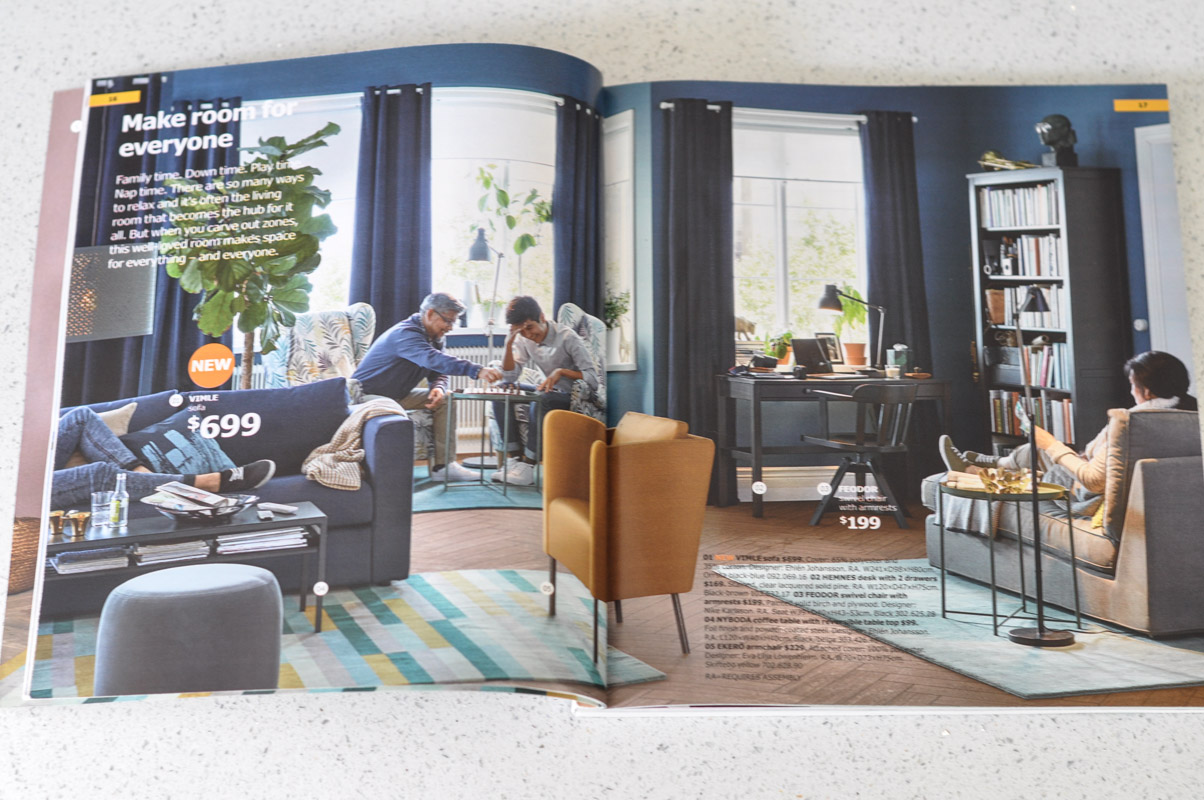
Jewel-tones have been recently creeping onto the scene, inching out the white-upon-white look that has been splashed upon Pinterest for years now. A navy blue VIMLE couch, a classic swivel FEODOR desk chair stained in a dark walnut, and the contrasting warmth of the gold EKERO armchair (only $230, are you kidding me?) add a certain sophistication and coziness to the room.
And those walls are such a bold and deep blue, no?
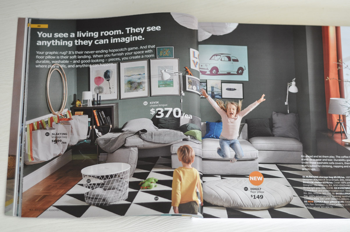
You can’t beat IKEA for their rugs. Typically costing your first born child and a mortgage payment, rug-shopping can make me suck in my breath, especially as I try to find one large enough to properly work in a space. The SILLERUP rug (6’6″ X 9’9″) – that gorgeous black and white geometric number – is only $160.
I know. Why don’t you already have one?
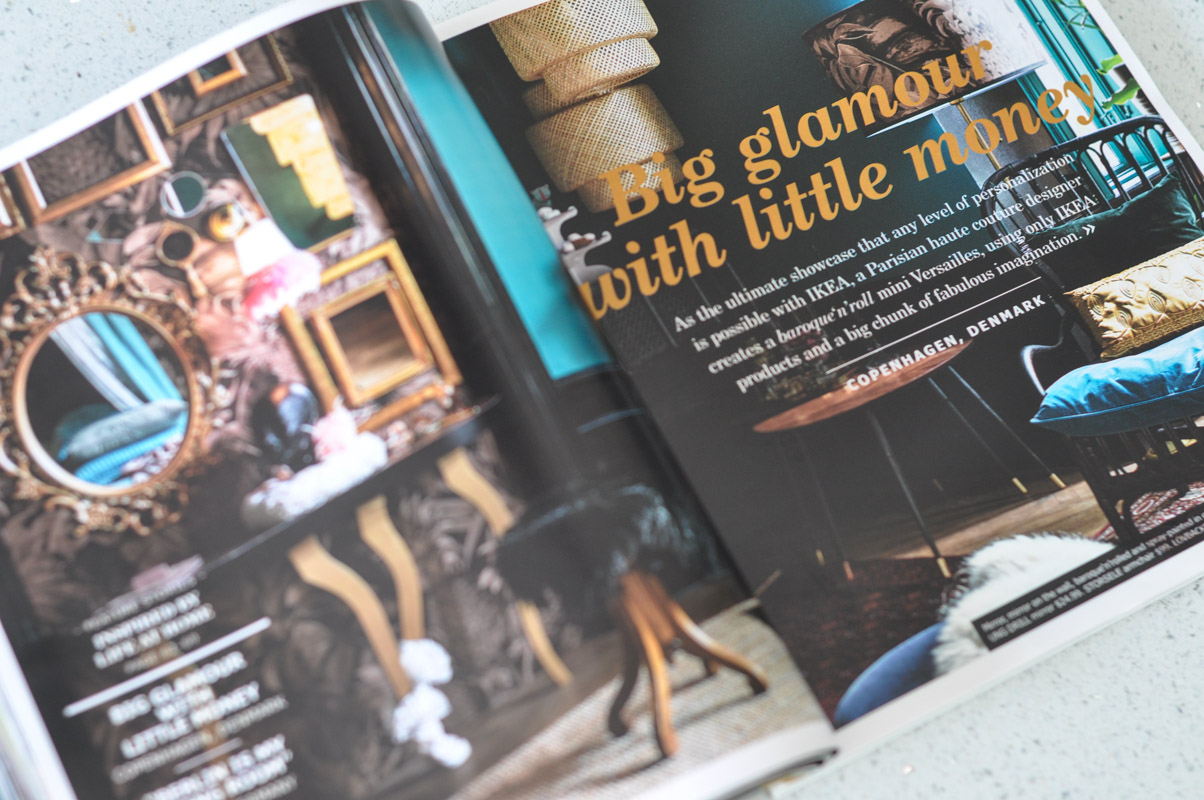
And this….. oh yes, I am LOVING the plush and lush of this spread. The title of the article speaks to me too, “Big glamour with little money.”
Who doesn’t want that?
IKEA brought in the eye of Maryam Mahdavi, designer of haute couture, to style an apartment in luxe colours and textiles. She alters the IKEA basics – canopies, flowerpots, lamps, etc – with paint and dye to create this beautiful, jewel-toned space.
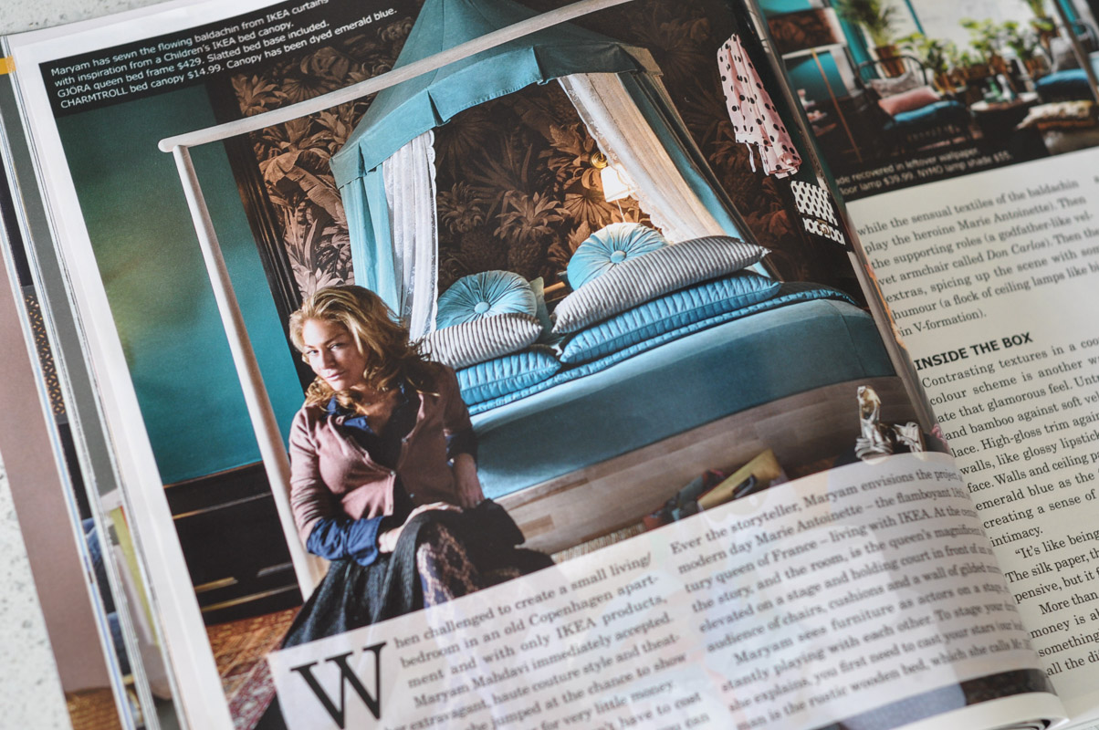
If this is where the IKEA catalogue is going, then I’m happily following. I love seeing how these “hacks” can take something from the Marketplace and transform it into truly individual design.
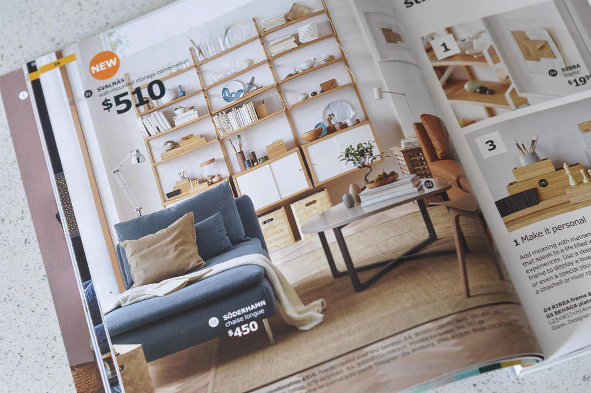
Covering topics from nurturing a green thumb to Scandi style to IKEA’s global conservation initiatives, this catalogue is worth scouring for more than just style inspiration. There’s even a little insert outlining new lower prices on some old favourites and some upcoming sales. I truly enjoyed myself as I embraced this new brave use of colour, the stories behind the styling, and the “hacks” that allow these furniture pieces and accessories to truly integrate seamlessly within a space.
Canadians: check your mailboxes for the catalogue near the end of the month. But until then, visit the online IKEA 2018 Catalogue to flip through the pages online.
